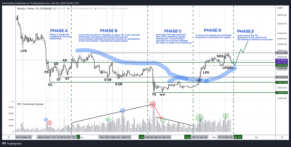
I took @TXWestCapital’s excellent Wyckoff chart for BTC and changed it slightly to fit current PA. I also included some explanations. Volume is pretty tough to read. The blue circles are where I have trouble explaining the volume peeks with PA. Legenda in next tweet.
